In the previous article, we introduced the new filtering capabilities added to Assign/Enroll Group. In this article, we’ll cover the rest of the improvements made to Assign/Enroll Group in version 7.2.
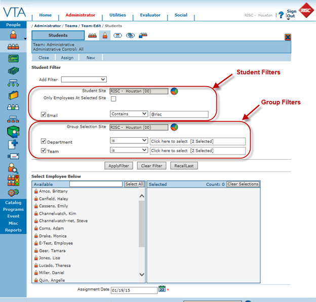
In addition to the new style of filtering, you will notice that we reorganized the page a little. The filters section was moved to the top of the page and the student selection area to the bottom. This is in keeping with the standard page organization on grids in Backoffice.
Even though the page has been reorganized, the buttons Apply Filter, Clear Filter and Recall Last operate the same as in previous versions.
However, selecting students is a little easier than before. In previous versions, you had to select a student and then user the > button to move the student from the Available to the Selected list. Now, all you have to do is click on a student’s name to move that student to the Selected list.
Looking for a particular person? Just start typing that person’s name in the search to jump to that person in the list of Available Students.
Two students with the same name? Just hover over the icon to the left of the student name to display more information about the student in a tooltip.
Don’t see the field you need in the tool tip that helps you distinguish between the students? This feature uses the Student grid tooltip settings, so you can control the fields displayed in the tooltip by saving the appropriate fields on the tooltip for the Student grid.

