Customizing Learner’s UI
One of the most underutilized features of Learner is the ability to “theme” the user interface (UI). Did you know…
- Every image displayed in Learner is part of a Theme?
- Every color, on every page, is controlled through the Theme?
- Each site in Learner can have its own Theme?
- A Theme can set the minimum height of every row in every grid?
- The height of the header row in tables and grids can be set through the Theme?
- Grid lines in Learner can be removed through the Theme?
- You can use images for the background header rows in a grid…using Theme settings?
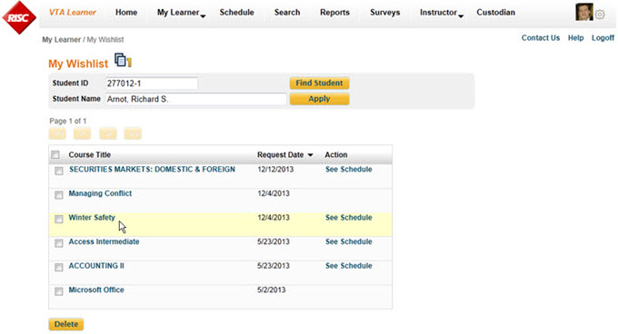
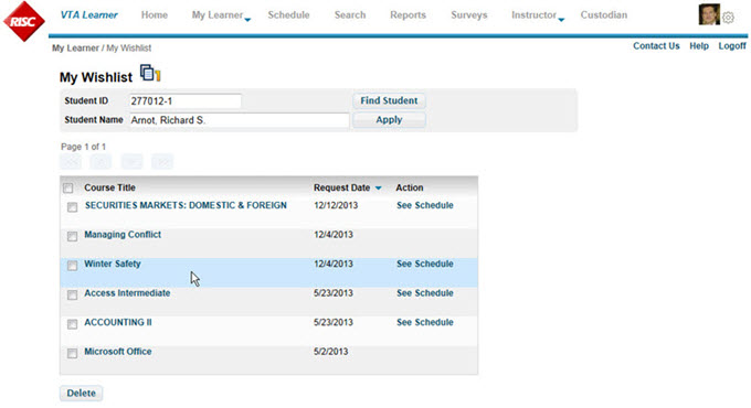
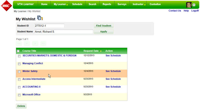
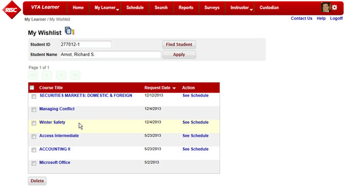
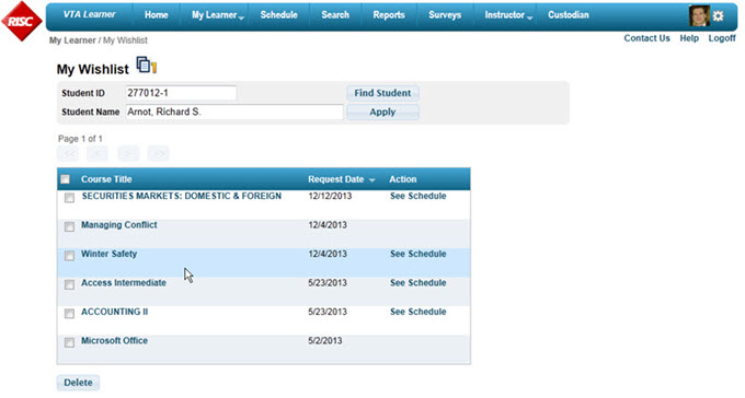
Some example themes are in the screen shots below,
[wpic color=”blue” visible=”1″ width=”680″ height=”440″ speed=”2000″ auto=”4000″]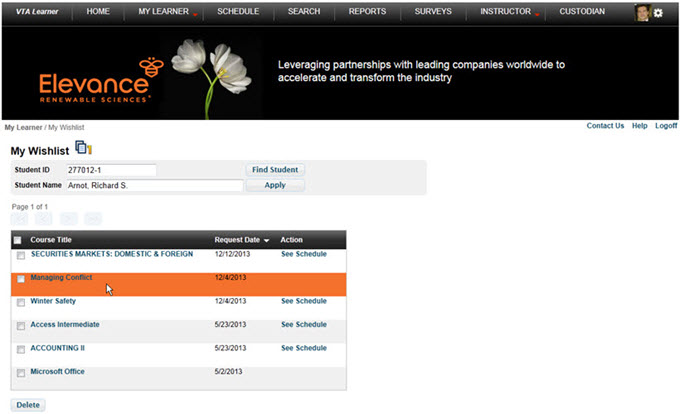 /!
/!  /!
/!  /!
/!  /!
/!  /!
/!  [/wpic]
- The blue, red and green themes very similar, just different colors used for the various styles.
- The theme with the gray text menu eliminates the background color and is overall a more subtle theme. Even the bar underneath the menu items was added through the theme files.
- The other gray theme emulates the Amazon.com web site, right down to the button color. Note that the Amazon theme uses horizontal lines in the grid, while the others use alternating row colors.
- The black, theme shows a customized graphic below the menu.
The key point about all these examples: No custom programming was required. Only the CSS and SKIN files were changed.
